Use Less Text

A few weeks ago, I introduced 2 Design Changes that Follow All Brain Rules.

Use Less Text

Everyone has heard the phrase, "A picture is worth a thousand words." Turns out, it's true. Written language has evolved over the years from cave drawings and paintings. Indeed, text is nothing more than a series of very simple pictures. For this reason, the brain takes considerably longer to decode strings of text (i.e. bulleted sentences) than it does single words or short statements. In other words, pictures are faster at conveying information than words – at least when we're talking about concepts and ideas (detailed data is difficult to convey via words or pictures – which is why scientific papers turn to tables and charts).

Here are two steps you can take to use less text.

1. Whittle your titles. Take the time to reduce slide titles down to their core meaning. This will remove clutter and superfluous information that can confuse and distract your students. Use short, concise titles to get the main point across. Then fill in the gaps while lecturing. This allows the student to understand the context which aids in better retention of the details you provide.

Oftentimes, I find a lot of redundancy in slide titles throughout a lecture. For instance, "Using Peer Mentors to Drive Students Toward Deeper Learning and Productive Reflective Writing" could become "Peer Mentors Improve Learning."

"What Do Professional Learning Communities Have to Do With Factoring A Trinomial?" could become "Math and Society" or "The Role of Math in Society."

"A History of the Culture of Tea in Britain" might be simplified as "British Tea Culture."

2. Remove bulleted text. Bullets on a slide often serve only as lecture notes to prompt the professor and are not necessary for the students. Sure, they need to know the information, but you're going to explain the important concepts during the lecture. If you need those notes while you're presenting, cut and paste them into the Presenter Notes in your slideware. You can then print off the slides as lecture notes or use Presenter Mode while in class. Remember, guns don't kill people, bullets kill people.

2 Design Changes That Follow All Brain Rules

Dr. Medina's Brain Rules are fascinating. Not in the same way that Brian Greene's eloquent description of The Elegant Universe is fascinating. No, it is much simpler than that. In fact, Brain Rules are fascinating because they are simple. While they are based on years of complicated scientific research and their implications are far reaching, Dr. Medina's rules to survive at home, work, and school are so simple that it is fascinating that we didn't think of them earlier. In a similar way, it is nearly laughable to me that PowerPoint slides are still designed in a complicated and counter-intuitive manner. Due largely to the misused hierarchical organization techniques that are the foundation of Microsoft's templates, professors, lecturers, and students continue to fill their slides with line after line of boring, bulleted text.

Fortunately, the steps to improving lecture slides are as straight forward and obvious as are Brain Rules. In fact, there are two design changes that can be used on any slide deck to instantly improve it's effectiveness.

  1. Use Less Text
  2. Use More Images

In upcoming posts, I will explore each of these in more detail and give practical examples of how they can make an impact. For now, see how you can apply them to your lecture slides.

William the [African] Conqueror: Of Windmills and Presenting

After a short TED Talk 'fast', I've started devouring these amazing talks again, and this 5 minute appetizer was sensational.

William Kamkwaba is a young African man who harnessed the power of wind to help feed his family and transform his small village. In this short presentation he shares his inspirational story.

What fascinates me is that William was able to give an engaging and motivational talk without having so much as a high school education. Most people who are inexperienced presenters tend to use the same crutches: default PowerPoint themes, bullet points, notes, few pictures. But not William. Notice the simplicity of his slides. Many of them are full-bleed photographs. He doesn't use bullet points and he speaks in a natural, conversational tone. Most importantly, his message comes from the heart. Building windmills, and engineering in general, is something that he loves.

William shows that you do not need to be a trained and experienced public speaker to present well. If you are a teacher or university professor, there are a few simple things that you can do to improve your presentations or lectures.

Enjoy the talk.


YouTube - How NOT to use PowerPoint!

YouTube - How NOT to use PowerPoint!

I just came across this video that I watched quite a while ago. It's a humorous take on the very serious problem of PowerPoint misuse. I like it because, personally, I am so passionate about the need to rethink slides that I think others may be taken aback at first.

Humor helps people relax. They become less defensive and allow themselves to be a little more vulnerable. This, in turn, helps them to be more open to change.

Watch the video and see how easy it is to agree with Don.

According to Don McMillan, here is a humorous & yet insightful viewpoint on how people (teachers included) should not be using PowerPoint.

Mini-Makeover: Chemistry Lecture

I was studying for my chemistry class when I got the sudden urge to see how difficult it would be to redesign just a few slides from a recent deck on Acids, Bases, pH, etc.

Altogether, this took around 20 minutes to recreate the 2 slides (which then became 5).

I began searching for images on iStockPhoto.com but then realized I should try looking in Flickr's Creative Commons library. It was so easy! If I have more time, I will continue to do mini-makeovers of my lecture slides or other presentations I come across.

Slide Makeover: Utah's Changing Demographics

I was involved in the preparation for the first annual English Language Learners Symposium at Brigham Young University, which was held three weeks ago. My job was to redesign the PowerPoint presentations of the keynote speakers for Friday's session. I couldn't have been more willing, especially because the man in charge of the symposium told me he wanted the presentations to be beautifully designed, with a lot of visuals, a lot like the TED Conference. As you probably know, I am a huge fan of the TED Talks and have read Slide:ology, which is the presentation design bible written by Duarte Design, the master design firm behind many of this year's talks.

I redesigned three presentations for the ELL Symposium, and will post some of the slides here. I was unable to see the presentations – or even speak with the presenters – beforehand. In some cases I was able to communicate with the presenters during the redesign, but to varying degrees.

[All of the content (ideas, data, etc.) in these presentations is the property of the respective speakers and is not to be copied in any form. The images are from iStockPhoto.com or otherwise licensed to be used in these presentations.]

The first is a presentation by Dr. Pam Perlich of the University of Utah, who spoke about the changing demographics in Utah. She is an excellent speaker with a great deal of experience. I am pleased to say that she embraced my design ideas and changes.
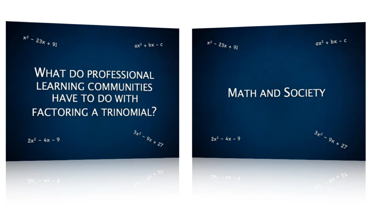
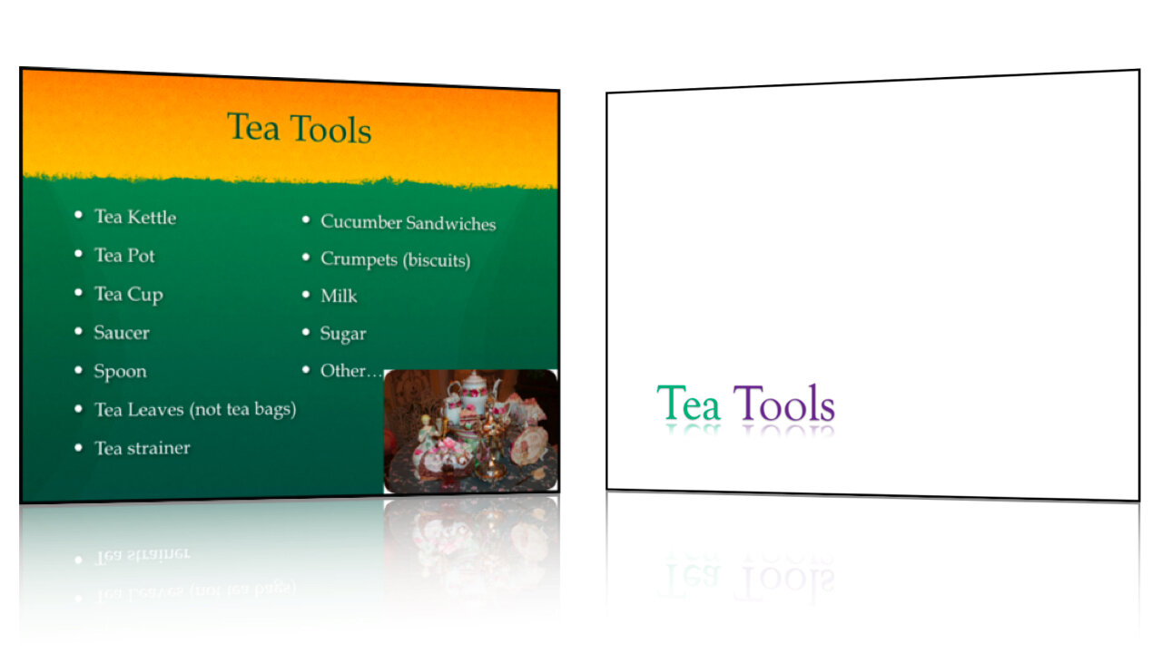
BEFORE:

AFTER:

The How

I imported the original PowerPoint file into Apple Keynote. For most of the slides, I simply applied the theme I chose, and made some additional tweaks. However, for many of the charts, I had to either re-enter the data into a new chart in Keynote, or copy the graph itself from PowerPoint, paste it into Keynote, and then apply the theme.

The Why

1. In general, I removed any unnecessary text from the screen and relocated it into the notes which would show on the presenter's display, like this:

Picture 1.png

This would allow the audience to focus on Dr. Perlich as a speaker, rather than let them be distracted by all of the text that just begs to be read.

2. I also used stock images that exemplified the point she was trying to make.

3. Lastly, I redesigned the graphs and charts to have a similar feel and to be less distracting to the eye.

Stroke of Genius

The one slide that still gets me excited is title slide. I searched and searched for an image that represented the demographics of Utah – maps, county maps, even forest trees sprouting up from a map of Utah – but couldn't find anything satisfactory. I decided to just start over, and this idea came: I opened Google Earth, exported an image of a view of Utah, then asked one of my co-workers to highlight the border using PhotoShop. While the image doesn't represent demographics per se, I think it is a subtle yet attention-grabbing visual.

Lessons Learned

The importance of working with the speaker was made very clear to me. Dr. Perlich had some specific reasons for designing her original slides the way she did, and actually taught me a few things about working with charts and data.

Since I wasn't able to see Pam present before designing the slides, I wasn't familiar with her pace and timing. After seeing her present using my slides, there were a handful of changes that I would have made. First, I would have used different transitions. Her pace was such that the Dissolve transition that I chose really slowed her down. It is probably the least distracting transition, but when the pace is picked up it can be severely handicapping.

Second, some of the most important points she made (which could not have been represented by data) were not in her slides at all, but were poignant stories she told. If I had been aware of this, I would have inserted a blank slide to draw the audience's focus to her, or perhaps put up another powerful image that illustrated her anecdotes.

More to come soon.

PowerPoint Handouts Not Effective

A while back, Mike Pulsifer pointed me to an article on Ars Technica: Study: class podcasts can lead to better grades. The article, and the research done by State University of New York, focus on whether using podcasts as an extra study resource for students can improve grades. I am a huge fan of podcasts. Over the past couple of years I have learned an immense amount by listening to podcasts – from language, to photography, to brain science, and design. On iTunes U anyone can access lectures from some of the best universities in the country by downloading and listening to podcasts of each lecture. This is a great way to acquire knowledge or to get further study for a class you're currently taking.

What I found even more interesting about this study was the method of teaching and study that wasn't as effective: handing out printed copies of the lecture slides to students. As the author of the article notes, passing out PowerPoint handouts has become "all the rage" in many lecture halls, within or outside the academic world. In fact, two of my previous science courses are designed around PowerPoint handouts – every slide of every lecture for the entire semester is included in a "Lecture Guide" that the students purchase at the beginning of the semester (sometimes in lieu of a textbook). Handout small.jpg

What's the problem with this?

PowerPoint slides are NOT notes. They should not function as notes. Not for the teacher and especially not for the student. Retention increases when exposure to information occurs across multiple modalities - listening to a lecture, reading a textbook, discussing a subject in a study group, etc. (You may be familiar with the idea of being a visual vs. kinisthetic vs. auditory learner.)

Business Plan Competition.jpg

A printout of common lecture slides is not much different than the lecture - except that you probably aren't having them read to you by a Ph.D.

But repitition increases recall, right?

Yes, that is true, but do not forget that certain modalities of learning are less effective than others. As Dr. John Medina points out, "the brain sees words as tiny pictures. Reading creates a bottleneck." (Brain Rules, pg. 234)

This is just one more reason to do away with text on those lecture slides, replace them with images, and maybe even replace the handouts with a link to the podcast version of your next lecture.