I created this a while ago and never posted it because I didn't think it was that good.
Who am I kidding… It's awesome!
It would be best to follow this link to view the presentation with added notes that explain each slide.
Brainslides
I created this a while ago and never posted it because I didn't think it was that good.
Who am I kidding… It's awesome!
It would be best to follow this link to view the presentation with added notes that explain each slide.
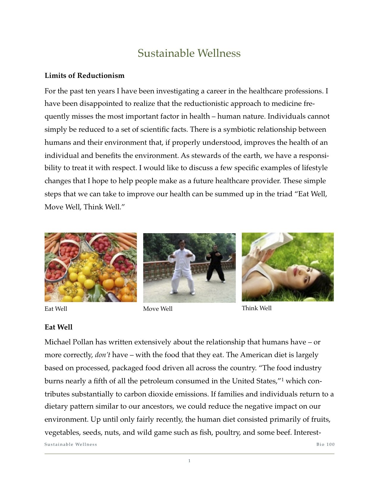
Most of the posts here on Brainslides are directed towards teachers who want to improve their slide design and presentation skills, but today I've decided to focus on the other half of the equation. Here are a few tips for those of us who aren't yet desperate enough to throw tomatoes at the projector screen but still want to make the most of our time in the lecture hall.
Read MoreNot only am I passionate about improving the way presentations are delivered, but as a professional ballroom dancer by night, I also happen to be very passionate about dance. As you can imagine, it's not very often that those two passions meet up. Which is why I was ecstatic when I came across this fabulous TEDxBrussels talk about using dance instead of PowerPoint. John Bohannon – a.k.a. the Gonzo Scientist – is a biologist, writer, adventurer, and creator of the Dance Your Ph.D Contest. He masterfully demonstrated the technique of presentation via dance at the recent TEDxBrussels event as he shared the stage with 10 dancers from Minneapolis' Black Label Movement dance company. Watch the 11-minute presentation below.
While hiring a dance troupe for each presentation you give may be a little unrealistic, what I love about this innovative idea is that it contains all of the key ingredients or an effective presentation: engagement, novelty, repetition (albeit simultaneous repetition rather than sequential), and concision.
What other creative presentation methods could replace PowerPoint?
This recent TED Talk by Julian Treasure on 5 ways to listen better is a fabulous example of an effective presentation. Watch it, then let's talk about what you can do to improve your presentations.
This talk is only 7 minutes long. As Julian explains, with our busy world, our attention spans are shrinking. We pay attention to fewer things for shorter periods of time. Keeping a presentation short helps ensure that the audience doesn't reach the point of being antsy and bored. But what if you're teaching an hour long class or have to give a presentation that is longer than 10 minutes? Break it down into smaller segments. As Dr. John Medina explains in Brain Rules, students tend to tune out at around the 10 minute mark, so structure your lesson to take advantage of that. Divide the lesson or presentation into 10 minute chunks, create your slides around those segments, and build in a break or related activity in between each of them. This helps regain the attention of the students. Even a simple joke can work – as long as it is directly related to the topic. Breaking down the lesson into smaller chunks also makes it easier to prepare.
When you watch the video, notice how there is no self-introduction, incidental anecdote about his plane ride, an lengthy list of thank you's, or a string of "umms" and throat clearing noises. He simply starts by stating the thesis of his talk, "We are losing our listening," which he promptly backs up with a clear set of data. This is the art of the cold start, which I have mentioned before. All of that warming up tends to bore the audience to sleep, while a brisk opening wakes them up and let's them know you mean business.

It's a theme that I repeat over and over again. Your slides are too complex. Everyone tries to cram too much information on a screen which is not meant for detail. Slides accompany your talk, they do not deliver it. Julian's slides are dead simple. No bullet points, no title and body text. Just simple phrases in large text on a decent colored background. They accompany his talk and reinforce the message he is trying to share.
This talk was about sound: How we listen and why we should pay more attention to it. Julian played sounds in the background while he presented – cocktail party chatter, pink noise, crowds, birds in a forest, etc. – to give the audience a feel for what he was describing. The reason this was effective, though, was not simply because he used audio, but because he used it almost imperceptibly. I see lots of people use media in their presentations – like music or YouTube videos – but the process isn't always as seamless. Instead, the presenter exits out of the presentation revealing a mess of files on the desktop, navigates to a YouTube video, plays it in the window rather than fullscreen, fiddles with the mouse or volume while it is playing, and then returns to the presentation. This process is full of distractions and empty seconds in which the audience can drift off. If you want the media to make an impact, insert it into your presentation and set the appropriate timing so that it plays when you want it to. It can sometimes be difficult to find the right media format to use with Microsoft PowerPoint, but experiment a bit and check Microsoft's Support site for help. (If you're using Apple's Keynote, you will rarely run into playback issues with media.)
We've all seen it: the presenter pacing awkwardly around the stage, more often than not in a little jazz square near the lectern, pausing periodically with one leg crossed in front of the other. I like to call it the "presenter potty pace," and it happens when we are unsure of how to stand and what to do with our arms. Standing comfortably takes practice and awareness. Julian demonstrates it perfectly at 6 minutes 40 seconds into the video when he suggests that we be "connected in space and in time to the physical world around us, connected in understanding to each other." This also explains why nervous presenters look uncomfortable in their own skin – they lose connection with the present moment. Their minds are racing thinking about themselves and what they're supposed to say, and whether the presenter remote is working. If they just calm their minds, acknowledge where they are, and focus on their audience, they can relax into their stance and present comfortably and naturally. Julian is so adept at this, that, for a moment, he even had the confidence to dance a waltz on stage!

Learn to stand comfortably while on stage.
The TED stage has a large circle of red carpet which, I assume, is meant as a boundary for the presenter. There are likely many reasons for this, such as making it easier for stage lighting and the camera crew, but it also benefits the presenter. If they are conscious of the boundary, they will not wander frantically around the stage. Having a soft limit gives you a safe area to move around in. Just like Julian does, it is ok to shift your weight, take a step or two, and move your arms deliberately. Oftentimes, I will script a stage move at a specific point in my presentation, i.e. walk across the stage while introducing the second topic, stay there, then walk back while introducing the third topic. In general, though, stand with your feet about shoulder width apart and your hands relaxed at your side or in front of you if you tend to gesture a lot.
Of course, for teachers, it may be a little different. It is important to move around the classroom and maintain a close connection with the students, especially in K-12 (although, if you're using PowerPoint in grade school, we need to have another discussion). But when you are moving among the audience, it is even more important to maintain that relaxed confidence and presence of mind.
What other presentation tips can you learn from this wonderful TED Talk?
Recently, there has been some discussion among various presentation blogs on the practice of distributing handouts to accompany presentation slides. (Visit Speaking About Presenting or Phil Presents to get caught up and learn some great tips.) This topic goes hand in hand with my own previous posts on slideuments and docuslides, since most presenters create their slides to also serve as a handout (resulting in slideuments), while a few presenters present their documents (resulting in docuslides). The problem with both slideuments and docuslides is a misunderstanding of how information should be presented. As I have explained before, lectures and presentations primarily utilize oral information with visual supplements. Documents – papers, essays, books, etc. – are primarily textual information. Documents are meant to be information dense, while slides are not.
Let me restate this more transparently:
It really is that simple! If you are e-mailing, mailing, distributing handouts, or otherwise delivering information which will stand on it's own, it does not make sense to use PowerPoint or other slideware to create the document!
One solution to slideuments is to create both a document and accompanying slides – and it doesn't take as much work as you might think.
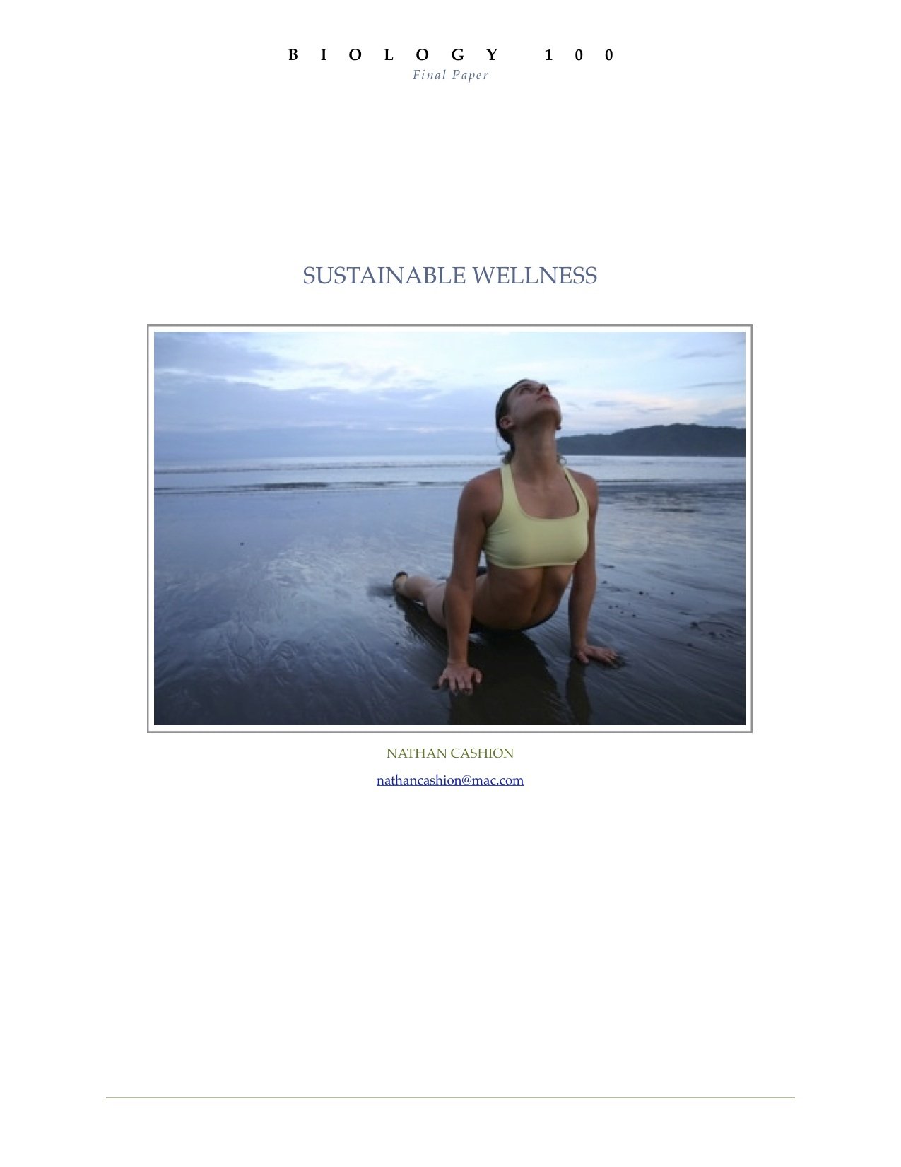
Some time ago I was required to write a final paper and give a presentation on the same topic for my biology class. I chose to research sustainable practices for healthy living. First, I wrote my paper using Apple's Pages (a word processor similar to Microsoft Word). Once that was complete, I then began to select the important points that I would cover in my presentation. I created a slidedeck using the same titles, images, and order of topics.
Click here to download the full paper: Biology 100 Final Paper
You can download the slides by visiting Slideshare.net.
You should never begin preparing for a presentation by creating your slides first. The act of creating slides tends to lead to tinkering with the technology. In fact, don't even design the document yet, just write out what you're going to present on in a free flowing fashion. (Garr Reynolds of PresentationZen fame, and Nancy Duarte both refer to this as going 'analog'.) Worry about the accompanying images and layout later.
Basic design principles state that two things that are supposed to go together look alike. Use the same font, color scheme, and – of course – images! People remember images up to 6x more than what they hear, so using the same images in both your document and presentation will lead to them remembering what you said.
Slideuments are an unnecessary, and unfortunate, habit among office personnel, presenters, and teachers. I have been subject to both extremes in my education. On the one hand, I've taken courses in which textbooks are all but replaced with printed PowerPoint slides... with random words blanked out as if it were a Where's Waldo game! On the other hand, I've sat in class, day after day, as the professor read off of web pages that contained the material for the course. I can understand how these practices might appeal to the professors – they're very convenient and require relatively little preparation for lecturers who are often more concerned with putting the final touches on their grant proposal or spending time in the research lab. But using docuslides or slideuments take valuable opportunities away from the student.
In the end, slideuments do not match Dr. Diamond's test of "using things that have been shown for learning, rather than just keeping up with the technology."
Slides should serve as a "visual soundtrack" to the presenter.
Read More[caption id="" align="alignleft" width="125" caption="Dr. Marian Diamond, U.C. Berkley"] [/caption]
During my semester studying anatomy for my undergraduate degree, I began downloading podcasts via iTunes U to supplement my own lecture experiences. I came across an anatomy course taught at UC Berkeley by the wonderful Prof. Marian Diamond. While listening to the first lecture in the series, I was extremely impressed with her calm and authoritative demeanor. All at once she exudes confidence and respect toward her students. After a short pause during the lecture to erase the chalkboard, she said, "I have to tell you why I don't use PowerPoint." I was overcome with excitement and anticipation as I waited to hear why this capable teacher purposefully abstained from using a popular technological tool. What followed was a brief yet powerful statement that every teacher who uses lecture slides should consider. I include it here verbatim:
"I have to tell you why I still use chalkboard and do not use PowerPoint. Because I've studied learning mechanisms long enough to know that it takes time to take in the primary information and associate it. I feel if I just flash on things like this you don't get it. If you write, you use your kinesthetic sense. That's one way. It slows me down, it slows you down. And I also repeat all the time, because we know repeating reinforces. First time through you have an ionic exchange, second time through you have protein synthesis. So we're using things that have been shown for learning rather than just keeping up with the technology."
Here is an audio clip so you can hear it yourself. Or you can download the full lecture audio from iTunes U.
© Audio Copyright 2006, UC RegentsI was thrilled with her explanation! It wasn't because she couldn't use PowerPoint, found it too cumbersome, or time consuming. It was simply that there was no pedagogical reason to use it. As far as learning is concerned, using the chalk board and encouraging the students to take notes is far more effective than flashing something up on the screen.
After further investigation, it seems as though Professor Diamond makes a similar statement at the beginning of every semester (see Fall 2007 and Fall 2008). This suggests that it wasn't just a passing thought in casual conversation, but that it is important enough for her students to understand the deliberate choice she made to improve their education.
Now, I am not saying definitively that you shouldn't use PowerPoint. But if you do, there had better be a darn good reason. Don't use it just because it's easier or because you want to look cool using 'up to date technology.' And further more, if you do use PowerPoint, you'd better make them darn good slides. That's what this blog is all about, so be sure to read some other posts. You might like to start with 2 Design Changes That Follow All Brain Rules, since we are talking about neuroscience here.
(Professor Marian Diamond is a professor in the Department of Integrative Biology at U.C. Berkeley. Her research includes neuroanatomy, environment, immune functions, and hormones. She has taught all over the world.)For thousands of years the human brain has developed to process the visual input received through the eyes from the surroundings. Survival depended on being able to see the mammoth from far off, spot the snake in the grass, or the color of fruit in a tree. Only recently in its evolution has the brain's visual system spent so much time decoding letters, such as the ones that make up War & Peace. The cortex of the human brain has developed immensely to be able to read and ponder such literary works, not to mention complex scientific textbooks. And yet, even now, the brain still responds more actively to vibrant pictures.
Trade weapons for art. Replace your bullet points with high quality photographs. Bullet points are great for shopping lists and talking points, but not for getting your point across. They just don't work, because text is boring and lists are distracting.
If each item truly is that important, create a separate slide with a high quality image that represents the idea. Or use an image to represent the overall idea of the list, and verbally give the key points of the idea.
Go ahead and bleed. Using a full screen image is much more effective than copying the thumbnail from a Google search. Instead, download the full resolution file and fill the screen with it.
[caption id="attachment_72" align="aligncenter" width="300" caption="Fill the screen with image for more impact"] [/caption]
Don't clip to save. This is one instance when cheaper isn't better. Don't use the built in clip-art for graphics. Dip into your classroom funds and purchase stock images for the really important lectures. Web sites like iStockPhoto sell high quality images for relatively low prices. Once you sign up as a member, you can access their Free Image of the Week. Collect these over the years and you'll have a substantial library of great images that are bound to fit in to your lecture slides somewhere.
[caption id="attachment_401" align="aligncenter" width="240" caption="Purchase high quality stock images for important presentations"] [/caption]
Join the commonwealth. Ok, so most classroom budgets won't get you very far, but there are alternatives. You can access a wealth of images created by amateur and professional photographers who license their images for reuse – it's called a Creative Commons license. I explained how to do this in a previous post.
But that's not all! There are many organizations who provide many of their images for free. Just for starters, visit some of these sites:
[caption id="attachment_397" align="aligncenter" width="270" caption="NASA provides high quality images for public use."] [/caption]
DIY. If you're still struggling to find the image that you want, get creative and Do It Yourself. Grab a digital camera (a 3-megapixel camera is commonplace today and is sufficient quality for a presentation) and make the image yourself. Take a moment to review some basic photography concepts, such as the Rule of Thirds and lighting, at a website like Digital Photography School and then go out and explore your inner Ansel Adams.
There is so much more that we could discuss in relation to the use of images in your lecture slides, but they can be addressed in future posts. For now, see how you can improve one of your lecture slide decks by using less text and more images.