A Solution to Slideuments

Recently, there has been some discussion among various presentation blogs on the practice of distributing handouts to accompany presentation slides. (Visit Speaking About Presenting or Phil Presents to get caught up and learn some great tips.) This topic goes hand in hand with my own previous posts on slideuments and docuslides, since most presenters create their slides to also serve as a handout (resulting in slideuments), while a few presenters present their documents (resulting in docuslides). The problem with both slideuments and docuslides is a misunderstanding of how information should be presented. As I have explained before, lectures and presentations primarily utilize oral information with visual supplements. Documents – papers, essays, books, etc. – are primarily textual information. Documents are meant to be information dense, while slides are not.

Let me restate this more transparently:

  • If you are presenting a lot of information, non-verbally, create a document.
  • If you are presenting orally and want visual aids, create slides.

It really is that simple! If you are e-mailing, mailing, distributing handouts, or otherwise delivering information which will stand on it's own, it does not make sense to use PowerPoint or other slideware to create the document!

One solution to slideuments is to create both a document and accompanying slides – and it doesn't take as much work as you might think.

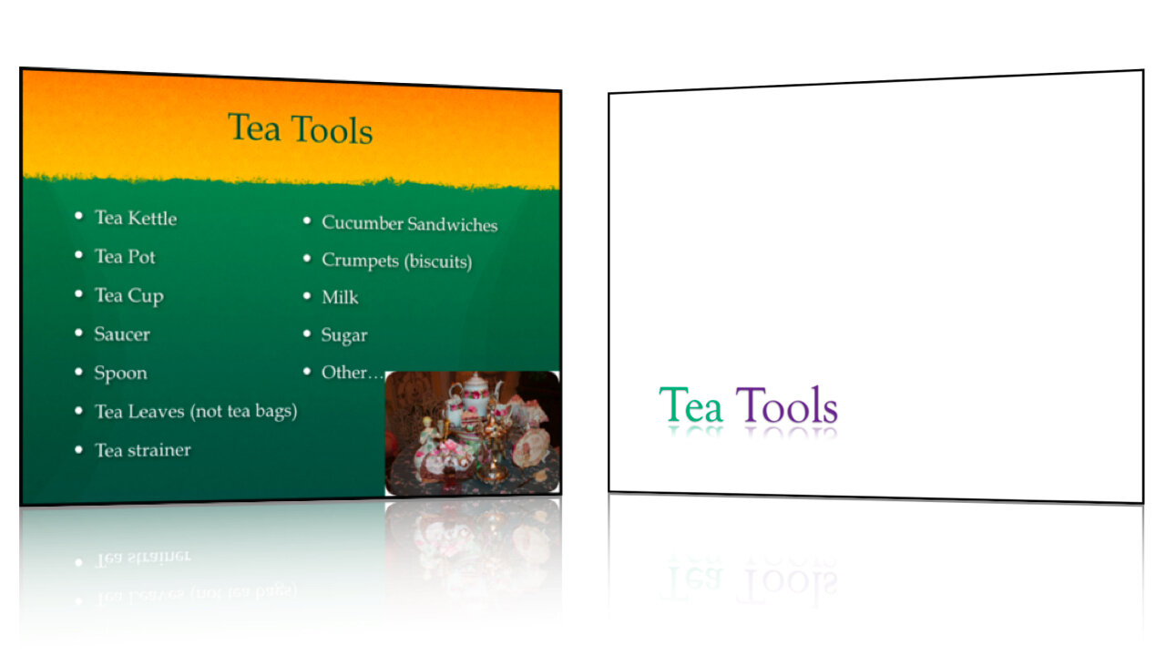
Some time ago I was required to write a final paper and give a presentation on the same topic for my biology class. I chose to research sustainable practices for healthy living. First, I wrote my paper using Apple's Pages (a word processor similar to Microsoft Word). Once that was complete, I then began to select the important points that I would cover in my presentation. I created a slidedeck using the same titles, images, and order of topics.

Click here to download the full paper: Biology 100 Final Paper

Biology Final Presentation

You can download the slides by visiting Slideshare.net.

There are two important things to remember:

1. Create the document first.

You should never begin preparing for a presentation by creating your slides first. The act of creating slides tends to lead to tinkering with the technology. In fact, don't even design the document yet, just write out what you're going to present on in a free flowing fashion. (Garr Reynolds of PresentationZen fame, and Nancy Duarte both refer to this as going 'analog'.) Worry about the accompanying images and layout later.

2. Use the same design elements.

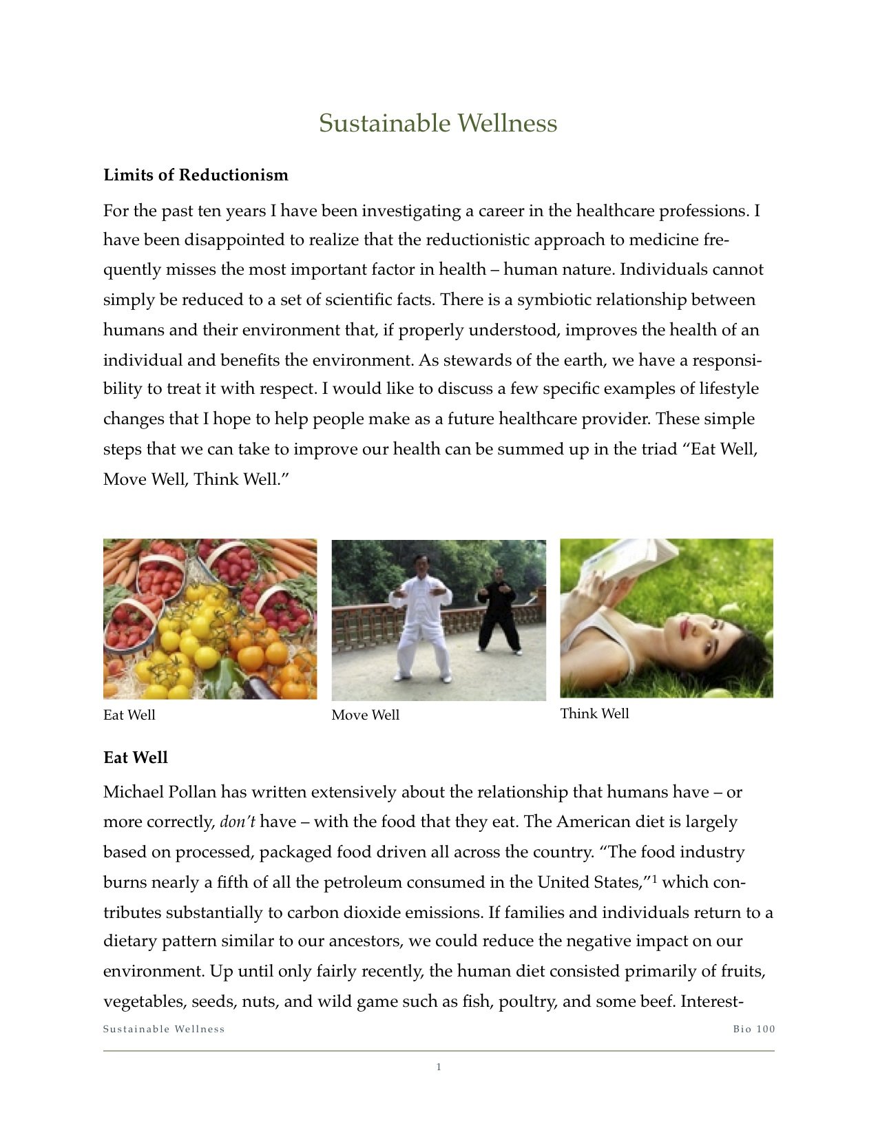
Basic design principles state that two things that are supposed to go together look alike. Use the same font, color scheme, and – of course – images! People remember images up to 6x more than what they hear, so using the same images in both your document and presentation will lead to them remembering what you said.

Slideuments are an unnecessary, and unfortunate, habit among office personnel, presenters, and teachers. I have been subject to both extremes in my education. On the one hand, I've taken courses in which textbooks are all but replaced with printed PowerPoint slides... with random words blanked out as if it were a Where's Waldo game! On the other hand, I've sat in class, day after day, as the professor read off of web pages that contained the material for the course. I can understand how these practices might appeal to the professors – they're very convenient and require relatively little preparation for lecturers who are often more concerned with putting the final touches on their grant proposal or spending time in the research lab. But using docuslides or slideuments take valuable opportunities away from the student.

In the end, slideuments do not match Dr. Diamond's test of "using things that have been shown for learning, rather than just keeping up with the technology."

Use Less Text

A few weeks ago, I introduced 2 Design Changes that Follow All Brain Rules.

Use Less Text

Everyone has heard the phrase, "A picture is worth a thousand words." Turns out, it's true. Written language has evolved over the years from cave drawings and paintings. Indeed, text is nothing more than a series of very simple pictures. For this reason, the brain takes considerably longer to decode strings of text (i.e. bulleted sentences) than it does single words or short statements. In other words, pictures are faster at conveying information than words – at least when we're talking about concepts and ideas (detailed data is difficult to convey via words or pictures – which is why scientific papers turn to tables and charts).

Here are two steps you can take to use less text.

1. Whittle your titles. Take the time to reduce slide titles down to their core meaning. This will remove clutter and superfluous information that can confuse and distract your students. Use short, concise titles to get the main point across. Then fill in the gaps while lecturing. This allows the student to understand the context which aids in better retention of the details you provide.

Oftentimes, I find a lot of redundancy in slide titles throughout a lecture. For instance, "Using Peer Mentors to Drive Students Toward Deeper Learning and Productive Reflective Writing" could become "Peer Mentors Improve Learning."

"What Do Professional Learning Communities Have to Do With Factoring A Trinomial?" could become "Math and Society" or "The Role of Math in Society."

"A History of the Culture of Tea in Britain" might be simplified as "British Tea Culture."

2. Remove bulleted text. Bullets on a slide often serve only as lecture notes to prompt the professor and are not necessary for the students. Sure, they need to know the information, but you're going to explain the important concepts during the lecture. If you need those notes while you're presenting, cut and paste them into the Presenter Notes in your slideware. You can then print off the slides as lecture notes or use Presenter Mode while in class. Remember, guns don't kill people, bullets kill people.

Finding High Quality Images with Google

Here is the first video tutorial. This is a follow up to my previous post on using Full Screen Images in your presentations. I mentioned how important it is to use images that are at least 800 x 600 pixels. Most people tend to grab images that look grainy and pixelated.

In this video, I will show you how to use Google Image Search to limit your image search to high quality images. As mentioned in the video, I do not recommend using Google to find your images since you will likely run into copyright issues. However, it is very probable that you will continue to use images from the web when time, budget, or other constraints prevent you from using license-free stock images, so why not learn how to make small improvements.

Find High Quality Images Using Google Search from Brain Slides on Vimeo.

Fill Screen with Images for More Impact

When you use images in your presentation you can make them have more impact by doing one simple thing: fill the screen with the image. In the printing business this is called full bleed. You've more than likely come across a book, magazine, or pamphlet that has a full bleed image. The great thing about full bleed images is that, rather than feeling like you are looking at a picture, you almost feel like you are in the image itself. That is because all distractions are removed by printing the image all the way to the edge of the page.

To make a slide have more impact and to avoid distracting elements, scale it up to fit the entire slide (or even larger if you want to focus on a certain element). Do not leave any portion of the background showing. Take a look at the following examples:

Full Bleed 1.003.png Full Bleed 2.002.png

In the original, I simply placed the image in the slide as the template suggested. It's fine, really, until you see the second option. Here I filled the entire slide with the image. This changes the viewer's perspective from looking at a picture to actually being in the picture. Also, it actually made more room to place the text - right on top of the image.

Troubleshooting

Now, I will let you know right up front that you will run into two problems with this approach.

First, you may want to use an image that is in portrait orientation rather than landscape (meaning it is taller than it is wide). If you were to fill the slide with an image like this you would have to crop it and most likely lose nearly half of the image. The solution is simple. Use a plain black background and fill the slide vertically while leaving margins on the side. When the image is projected on the screen, those dark margins will simply disappear because they blend in with the rest of the unused projector screen. Softening the edges of the picture will remove any sharp lines and help the photo to blend in even more.

Portrait Full Bleed.001.png

Second, after you scale the images to fill the slide, they may become distorted or "pixelated". If this happens, the image you are using does not have high enough resolution. Most projectors have a screen resolution of 800x600 pixels. (Newer models have 1024x768 or even higher if it is a widescreen projector.) In fact, 800x600 is the default resolution of new presentations in most software. If your image has a lower resolution and you stretch it to fill the screen, some detail will be lost. So be sure the images you use have a resolution of at least 800x600 pixels in order to fill the screen and maintain full quality.

In a future post I will explain how to determine the resolution of an image and even how to quickly find a suitable image on Google or Flickr.

The Science Of Presentations - SlideShare

I was browsing Slideshare, as I am wont to do, and came across this excellent new presentation by Kevin Gee. It's actually a slidecast, which means it includes his audio narration.
The Science of Presentation summarizes cognitive and educational psychology research as it applies to presentations. Kevin begins by explaining how our intuition does not always lead us to correct principles. This is so true! I frequently repeat that bad presentation design is not really the presenter's fault. They just do what the software and social norms dictate.

Kevin proceeds with 3 main topics:

1. Summary of Cognitive Theory

2. Factors for Effectiveness

3. Application

In the third section, Kevin does a great job of taking a poorly designed slide and transforming it into a few slides that are designed with the brain in mind.

My favorite part about the presentation: Kevin practices what he preaches. The whole presentation is well designed and does not distract from his narration.

The Science Of Presentations
View SlideShare presentation or Upload your own. (tags: kevin mayer)

(Via Slideshare.)