Adding images to Keynote couldn't be easier than this – I'll show you how to insert a set of images so that each fills the screen on a separate slide.
This video is also available via a free subscription to the Brainslides Video Podcast in iTunes.
Brainslides
Adding images to Keynote couldn't be easier than this – I'll show you how to insert a set of images so that each fills the screen on a separate slide.
This video is also available via a free subscription to the Brainslides Video Podcast in iTunes.
Almost everyone has used an image from the web in a presentation at one point or another. But did you know that doing so could constitute copyright infringement? In this video I'll show you how to search for images that can legally be used for free, thanks to a license called Creative Commons.
 Creative_Commons.m4v Watch on Posterous


Nathan - Presenting with Text
As a self-admitted, die hard, Apple fan-boy, it feels a bit strange for me to recommend a talk by the chairman of one of Apple's biggest rivals. But I respect improvement, and from what I've seen of Bill Gates, he is my top pick for Most Improved in the area of presentation skills. Not only does he now have great slides, but his delivery was much improved. It appears as thought Bill has taken the time to prepare the content of his talks, put forth the effort to design them well (or, more likely, the money to hire someone to design them), and accepted help from a speaking coach.
Read MoreRecently, there has been some discussion among various presentation blogs on the practice of distributing handouts to accompany presentation slides. (Visit Speaking About Presenting or Phil Presents to get caught up and learn some great tips.) This topic goes hand in hand with my own previous posts on slideuments and docuslides, since most presenters create their slides to also serve as a handout (resulting in slideuments), while a few presenters present their documents (resulting in docuslides). The problem with both slideuments and docuslides is a misunderstanding of how information should be presented. As I have explained before, lectures and presentations primarily utilize oral information with visual supplements. Documents – papers, essays, books, etc. – are primarily textual information. Documents are meant to be information dense, while slides are not.
Let me restate this more transparently:
It really is that simple! If you are e-mailing, mailing, distributing handouts, or otherwise delivering information which will stand on it's own, it does not make sense to use PowerPoint or other slideware to create the document!
One solution to slideuments is to create both a document and accompanying slides – and it doesn't take as much work as you might think.
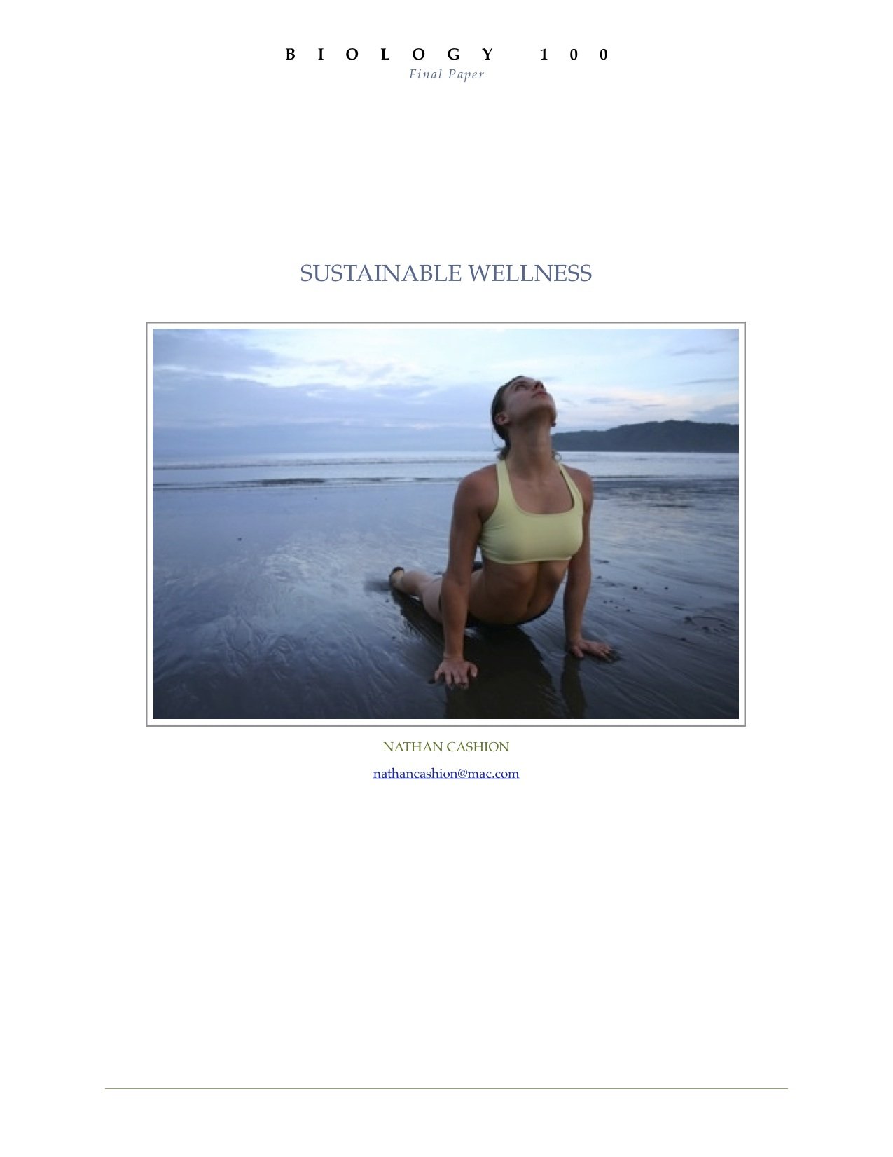
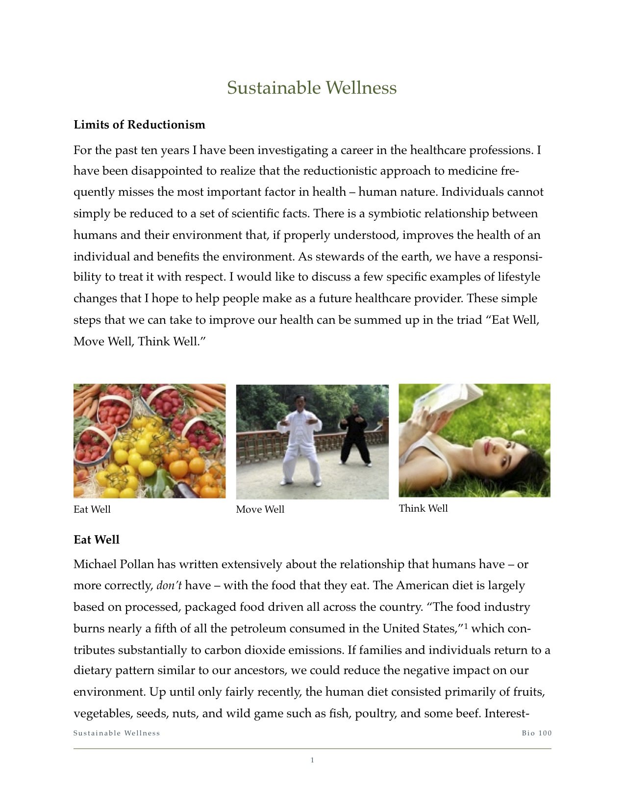
Some time ago I was required to write a final paper and give a presentation on the same topic for my biology class. I chose to research sustainable practices for healthy living. First, I wrote my paper using Apple's Pages (a word processor similar to Microsoft Word). Once that was complete, I then began to select the important points that I would cover in my presentation. I created a slidedeck using the same titles, images, and order of topics.
Click here to download the full paper: Biology 100 Final Paper
You can download the slides by visiting Slideshare.net.
You should never begin preparing for a presentation by creating your slides first. The act of creating slides tends to lead to tinkering with the technology. In fact, don't even design the document yet, just write out what you're going to present on in a free flowing fashion. (Garr Reynolds of PresentationZen fame, and Nancy Duarte both refer to this as going 'analog'.) Worry about the accompanying images and layout later.
Basic design principles state that two things that are supposed to go together look alike. Use the same font, color scheme, and – of course – images! People remember images up to 6x more than what they hear, so using the same images in both your document and presentation will lead to them remembering what you said.
Slideuments are an unnecessary, and unfortunate, habit among office personnel, presenters, and teachers. I have been subject to both extremes in my education. On the one hand, I've taken courses in which textbooks are all but replaced with printed PowerPoint slides... with random words blanked out as if it were a Where's Waldo game! On the other hand, I've sat in class, day after day, as the professor read off of web pages that contained the material for the course. I can understand how these practices might appeal to the professors – they're very convenient and require relatively little preparation for lecturers who are often more concerned with putting the final touches on their grant proposal or spending time in the research lab. But using docuslides or slideuments take valuable opportunities away from the student.
In the end, slideuments do not match Dr. Diamond's test of "using things that have been shown for learning, rather than just keeping up with the technology."
Last week I shared my thoughts on Kashi's confusing use of slides to present what was essentially a document. In retrospect, I might have been a bit incorrect using the term 'slideument' which more accurately applies to a set of slides that read like a document.
Two great examples of slideuments are 8 Keys to Effective Lecture by Terry Doyle at Ferris State University, or How Do I Use PowerPoint to Teach by Patrick Crispen (links are direct downloads to the PowerPoint files).
While the content in both of these presentations is valuable, presenting it in slide form does not make sense, since they were dense with text, did not use many visuals, and flowed much more like an essay.
On the other hand, Kashi's Yearbook celebrating 25 years was designed as a document but presented as slides... docuslides?? With this practice becoming common with online services such as SlideRocket and Slideshare, maybe it's time to coin a new term to use in conjunction with slideument.
Docuslides. I like it.
What do you think?
Slides are a visual supplement to the primary medium of information – speaking – while documents are the primary medium of information.
Read MoreFor thousands of years the human brain has developed to process the visual input received through the eyes from the surroundings. Survival depended on being able to see the mammoth from far off, spot the snake in the grass, or the color of fruit in a tree. Only recently in its evolution has the brain's visual system spent so much time decoding letters, such as the ones that make up War & Peace. The cortex of the human brain has developed immensely to be able to read and ponder such literary works, not to mention complex scientific textbooks. And yet, even now, the brain still responds more actively to vibrant pictures.
Trade weapons for art. Replace your bullet points with high quality photographs. Bullet points are great for shopping lists and talking points, but not for getting your point across. They just don't work, because text is boring and lists are distracting.
If each item truly is that important, create a separate slide with a high quality image that represents the idea. Or use an image to represent the overall idea of the list, and verbally give the key points of the idea.
Go ahead and bleed. Using a full screen image is much more effective than copying the thumbnail from a Google search. Instead, download the full resolution file and fill the screen with it.
[caption id="attachment_72" align="aligncenter" width="300" caption="Fill the screen with image for more impact"] [/caption]
Don't clip to save. This is one instance when cheaper isn't better. Don't use the built in clip-art for graphics. Dip into your classroom funds and purchase stock images for the really important lectures. Web sites like iStockPhoto sell high quality images for relatively low prices. Once you sign up as a member, you can access their Free Image of the Week. Collect these over the years and you'll have a substantial library of great images that are bound to fit in to your lecture slides somewhere.
[caption id="attachment_401" align="aligncenter" width="240" caption="Purchase high quality stock images for important presentations"] [/caption]
Join the commonwealth. Ok, so most classroom budgets won't get you very far, but there are alternatives. You can access a wealth of images created by amateur and professional photographers who license their images for reuse – it's called a Creative Commons license. I explained how to do this in a previous post.
But that's not all! There are many organizations who provide many of their images for free. Just for starters, visit some of these sites:
[caption id="attachment_397" align="aligncenter" width="270" caption="NASA provides high quality images for public use."] [/caption]
DIY. If you're still struggling to find the image that you want, get creative and Do It Yourself. Grab a digital camera (a 3-megapixel camera is commonplace today and is sufficient quality for a presentation) and make the image yourself. Take a moment to review some basic photography concepts, such as the Rule of Thirds and lighting, at a website like Digital Photography School and then go out and explore your inner Ansel Adams.
There is so much more that we could discuss in relation to the use of images in your lecture slides, but they can be addressed in future posts. For now, see how you can improve one of your lecture slide decks by using less text and more images.